
I am marking off my summer to-do list left and right! Last summer I let time get away from me too quickly (I think it was that new teacher/first summer off sort of fog) and did not get quite as much accomplished in our bungalow as I hoped. Well I'm not letting Mr. Procrastination get the best of me this time. The most recent accomplishment was our office makeover. This is the tiniest room in the house and still had evidence of the last homeowner's paint colors...which we have never been too fond of. However, the paint color was nice enough to "live with"...until now. Here's some before pics. (This is also "Boone's Room" hence the crate.)


We really liked the chair rail and the bottom tan color...thank you previous homeowner for taking care of that. It was the bright coral (brighter in real life) that we weren't digging as part of our "coastal meets country" design theme.
This itty bitty room is going to be a nursery one day...unless God surprises us with multiples...ha! Then there would be no room for that craziness. Really, it's that tiny. It would make a wonderful walk-in closet size. ;)
Anywho...we're all about working with what we have and working with a budget here at this casa.
Since this is going to be a nursery one day, we wanted to be smart from the get-go and use Zero VOC (chemical-free) and low odor KILZ and paint. I started out with this primer found at Wal-Mart. It was only $2 more than the normal stuff that has all those yummy chemicals ready to dance around your home. (Did you know the chemicals continue to release from regular paint anywhere from one to five years after application?) It only took one coat over the crazy bright coral.

After looking at many, many paint color choices, I actually finally found a shade of Wal-Mart's Better Homes and Gardens paint--seafoam--that went perfect with what we were going for. (You can see our different paint samples taped on the wall in one of the before pics.) Because our good ol' Wally World didn't have any "green" paint options, I took the sample to Sherwin Williams and they matched it there. We went with their Harmony paint that was also Zero VOC and low odor. Again, it was only a few dollars more than the other paint options. I think the peace of mind is worth the few dollars. We're so happy with the quality of this paint that it's definitely what we will purchase from here on out for any other painting we do.

Drumroll please....here are the after pics:


We love how the light color seems to open up the room and make it feel larger. It's also so much more soothing to look at.
Items I purchased:
-one gallon of KILZ: approximately $18.00
-one gallon of Sherwin Williams Harmony paint in seafoam: $35.09
-shelving from Kohls: on sale plus coupon $12.74 for two
-accessory pillow from Target: $9.99
Items found around the house:
-bud vase and flowers
-throw blanket
(to soften the black of the huge office chair my parents picked up for us at an auction for $20)
-rug
-pictures and frames
(pictures came from beaches we have visited on vacations or mission trips)
(frames came from a display of photos at our reception)
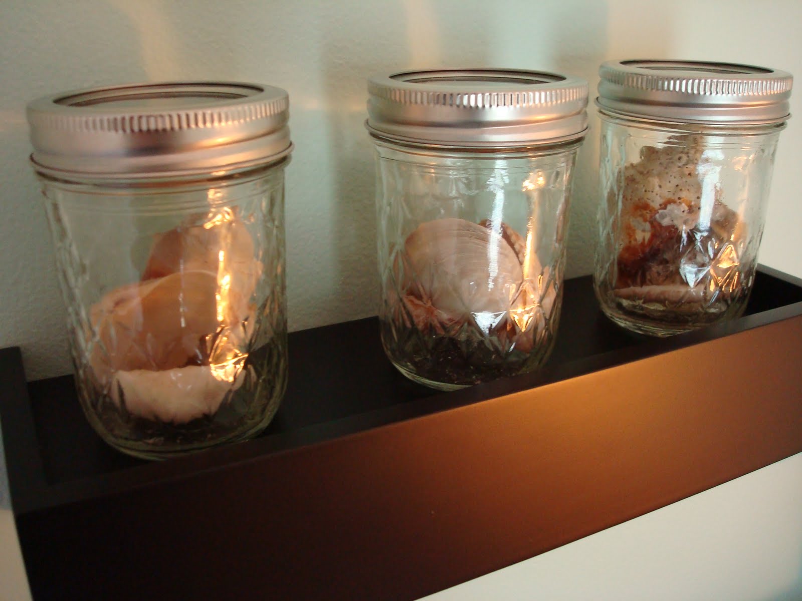
-ball jars with shells
( I had some left over jars from what I purchased in the winter to hold homemade hot cocoa mix for gifts)
(shells came from our fall beach trip to Ft. Myers, FL)
Other info:
-desk was bought at an unfinished furniture store and stained by my mom and me
for my townhouse in college
-you can read more about the file cabinet makeover here
-you can read more about the bookshelf makeover here
Total Cost: $75.82
(Move over "Design on a Dime" hgtv lady. Joking.)
When have you felt like an HGTV "design star"? What makeovers have you worked on recently or have in the works?


wow what a difference that color makes!! : ) It really brightens up and opens up the room. I love it!
ReplyDeleteoh it's beautiful! I can't believe it was so cheap!
ReplyDeleteWay to go, thinking ahead when making the color choice - which I love by the way!
ReplyDeletegreat job! looks lovely!
ReplyDeleteYou did a wonderful job Cait! I actually liked the "orange-y" color in the before picture (orange is my fav color)..but LOVE the after picture and the soft shade of blue/green you chose..it IS more relaxing to look at!
ReplyDeleteI think I felt like an HGTV design star last year when we moved into our home and we were painting up a storm in this place! Especially w/our living room..it was hideous floral paneling (can we say YUCK!) and I painted it a nice shade of aloe vera/sage green (which ironically I'm allergic to aloe vera..lol). I joined in the home tour the past couple of weeks and posted pics of my living room (last week) and kitchen/dining areas this week..you should take a look see! :-)
I liked the coral color but I LOVE the sea foam color, beautiful!
ReplyDeleteLOOKS GREAT CAIT! I love the colors, it opens the room and makes it feel so peaceful.
ReplyDeleteIt looks great! I love the paint color you chose - it's so fresh. Very nice! :-)
ReplyDelete